
One Library Chart for Dozens of Microservices
When a platform has five services, copying a Helm chart between repositories is fine. When it has eighty, copying becomes a policy decision you never made: every service has its own opinion about probes, labels, service accounts and rollout settings, and nobody can change them all at once.
The platform I worked on had a platform chart with 64 service dependencies across Go, PHP and Node, and it avoided that fate with a layered chart design. I want to describe how it fits together, because the trade-offs are more interesting than the mechanics.
Layer 1: a service describes itself, and nothing else
Open the Helm folder of almost any service in that platform and you will not find a deployment.yaml you wrote. You'll find a Chart.yaml and a values file. A Go API's looks like this (names changed):
name: orders-api
podspec:
  containers:
    api:
      mountDefaultEntrypoint: true
      image: {{ ECR_REGISTRY }}/orders-api
      tag: {{ RELEASE_VERSION }}
      command:
        - /entrypoint.sh
        - --check-network
        - --config=orders-api.config.json:/opt/app/config.json
      args: [/opt/app/app, web-server, --config=/opt/app/config.json]
      type: service
A worker that only consumes a queue looks nearly identical, minus any exposed port. A PHP service declares two containers (an nginx proxy and php-fpm) that talk over loopback inside one pod. A flag such as serviceBundledIamRole: true appears in most of them. Its exact effect lives in the library chart, but it is clearly the hook for giving each service its own ServiceAccount and cloud IAM role.
What the service author controls is small and intentional: which image, which command, which ports, which containers. Everything about how Kubernetes runs it is somewhere else.
Layer 2: the templates are one line long
Where does the Deployment come from? From a shared library chart. A library chart is a chart whose Chart.yaml declares type: library. It renders nothing by itself and only provides named templates ({{ define "common.deployment" }} and friends). Each service chart lists it as a dependency, helm dependency update pulls it into the chart's charts/ folder, and the service's own templates call into it. In the generated templates directory of a service, the entire deployment template is this:
{{- template "common.deployment" . }}
Service and ServiceAccount are the same, one template call each. The library chart owns the real definitions, so a change to probe defaults, labels, security context or rollout behaviour is made once and picked up by every service on its next release.
There's an extra wrinkle worth knowing. Those one-line templates are not committed by hand. A small tool, run as a container in CI and asked for the deployment, service and serviceaccount resources, generates them just before packaging. A second small tool, a container image used only in pipelines, then does the packaging:
- It validates that the required environment variables are set, failing early with a structured error if not.
- It rewrites placeholders in the chart with
sed: the service name, the release version (both for the chart and for the image tag), and the registry address. - It runs
helm dep update,helm package, and pushes the chart to the internal chart repository over HTTP with a bearer token.
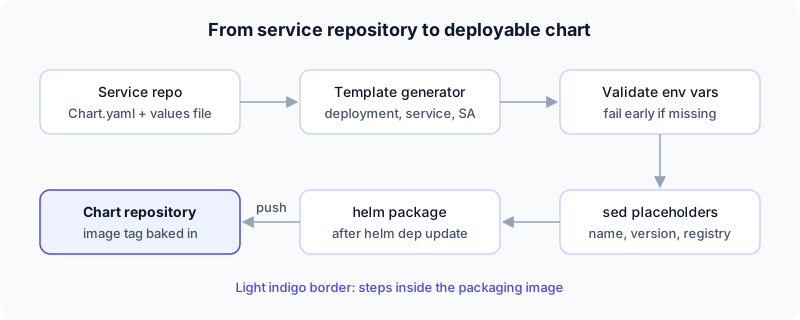 From service repository to a versioned, deployable chart
The consequence is that the image tag is baked into the published chart. Nothing downstream runs --set image.tag=.... A chart version is a deployable unit, and that makes "what is running in staging?" answerable by reading versions rather than inspecting clusters.
Layer 3: an umbrella chart installs the platform
Services are not installed one by one. A platform chart lists them all as dependencies, each behind an enable flag:
dependencies:
  - name: orders-api
    version: "2.14.0"
    condition: ordersApi.enabled
    repository: "@internal"        # published to the chart repository
  - name: legacy-portal
    version: "0.1.0"
    condition: legacyPortal.enabled
    repository: file://depcharts/legacy-portal   # vendored in this repo
Two repository styles coexist. 19 of the 64 are published to the chart repository and referenced by version, while the other 45 are vendored under a depcharts/ folder in the platform repo itself, which is where the older services live. A lock file pins exact versions, and a values file sets a default serviceVersion per service.
Per-environment behaviour then lives in a separate repository per environment, as several small override files concatenated into a single helm upgrade: environment identity, per-service overrides, application configuration overrides, which services are exposed publicly, and a "versions" file for pinning an individual service to a hotfix build. Splitting overrides by purpose rather than by service meant a reviewer could tell at a glance what kind of change a pull request was.
What this design buys you
Consistency you don't have to police. If every service gets probes, labels and service accounts from one place, you can't forget them in service #43.
Cheap onboarding. A new service is mostly a values file. The first deploy doesn't require anyone to learn Go templating.
Atomic platform changes. Fixing a deprecated API version or adding an annotation is a library change plus a version bump, not eighty pull requests.
Reviewable releases. Because versions are in git, a release is a diff of version numbers.
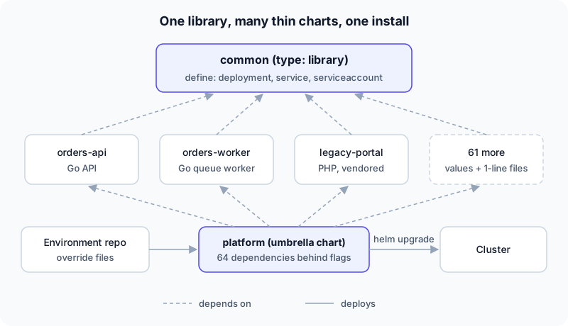 Three layers: one library chart, many thin service charts, one umbrella chart per platform
What it costs
I don't want to oversell it.
The library chart is a single point of leverage and a single point of failure. A bad change there reaches everything. It needs its own testing and versioning discipline, ideally rendering a representative set of services in CI before publishing.
Local readability suffers. When the only template in a service's repo is {{ template "common.deployment" . }}, understanding what actually runs means reading another repository. In my own exploration of this platform, the library chart wasn't vendored anywhere in the checkouts, so I could see that probes and resource settings were centralised but not what they were. That is a real documentation cost, and the fix is cheap: publish the rendered output for a sample service in the docs.
Escape hatches multiply. Real services have odd needs. Without a clear way to extend the library, you get if statements for one service creeping into shared templates. A post-render step (the platform used a small script to patch deprecated API versions and swap region settings for DR) is a pragmatic hatch, but it deserves tests too.
If I were designing it again
Keep the three layers. But I would add three things: a rendered-manifests snapshot test for the library chart, a published "what does a service get by default" page generated from the chart itself, and an explicit extension mechanism (named hooks or optional blocks) so one service's quirk never needs a conditional in the shared template.
Takeaway: Standardize how things run, not what they are. A service should describe its image, command and ports. The platform should decide the rest, once, in a place everyone can version and test.